Team

Cedio Kumbo
Design Lead
Tasks
Design Documentation
Building Figma Components
Creating the Design Library
Timeline
2 Months
Background context
As BU's Design team expanded, we encountered consistency issues within our team and, on a cross-functional level, with our development team. Often, we spent weeks trying to align our designs with the developed product, leading to significant delays.
Furthermore, the lack of guidelines resulted in major UX imperfections, a subpar user experience, and, in some cases, limited product accessibility.
Design Documentation
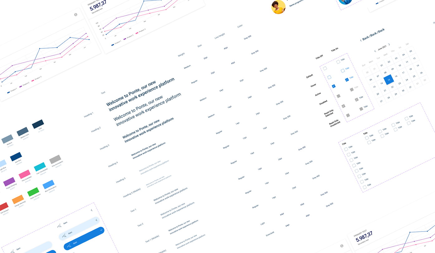
The first step was to create a design guideline for the entire team. We systematically reviewed our entire platform, gathering all the design components we had used. This task proved crucial in identifying inconsistencies, eliminating superfluous elements, and establishing a source of truth for the entire organization.
The overarching goal was to formulate clear guidelines on how to use each individual component and provide a rationale for these guidelines."
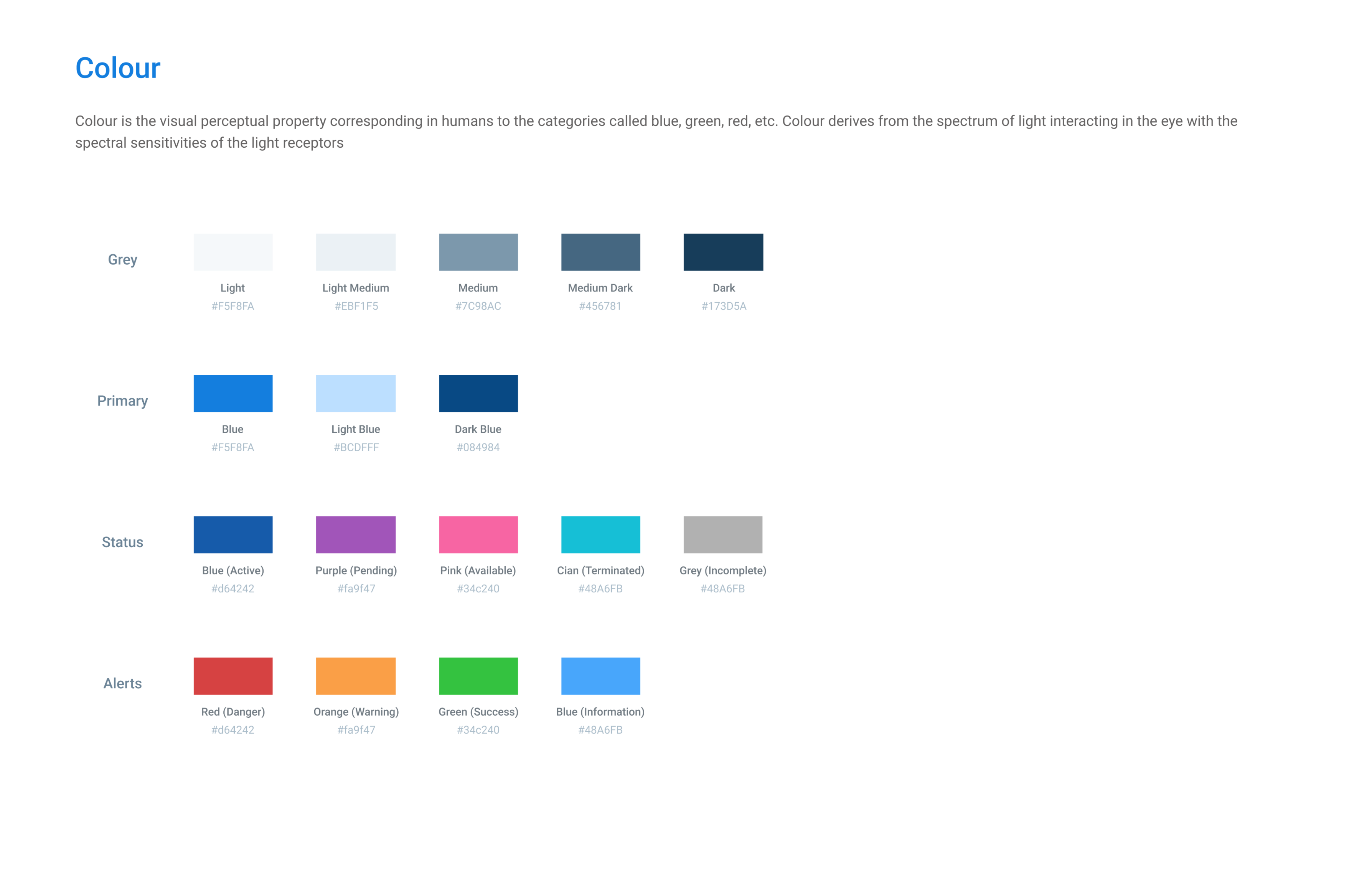
Colour
We began by reaching a consensus on the colours we intended to use. We agreed that the primary colour, primarily employed for primary CTAs, would be blue. In colour psychology, blue is often associated with positive and calming attributes. In UI design, the use of blue can evoke feelings of trustworthiness, professionalism, calmness, and serenity.
Other colours were also thoughtfully selected based on colour psychology and in alignment with the company's brand identity to create a cohesive and impactful brand experience.
Typography
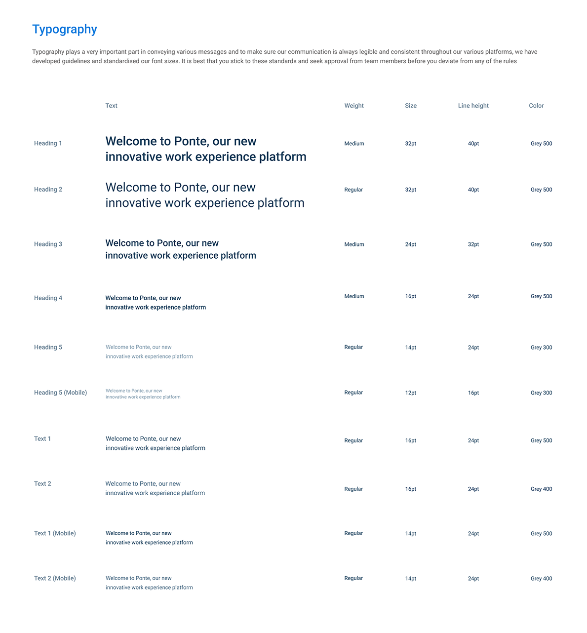
Because BU Technologies already has an established brand identity within its user base, we chose to maintain Robot as our main font.
However, we observed significant inconsistencies in terms of font sizes and weights. It was a valuable exercise to establish a standardized list of text styles and determine where to use each one of them.
Buttons and more...
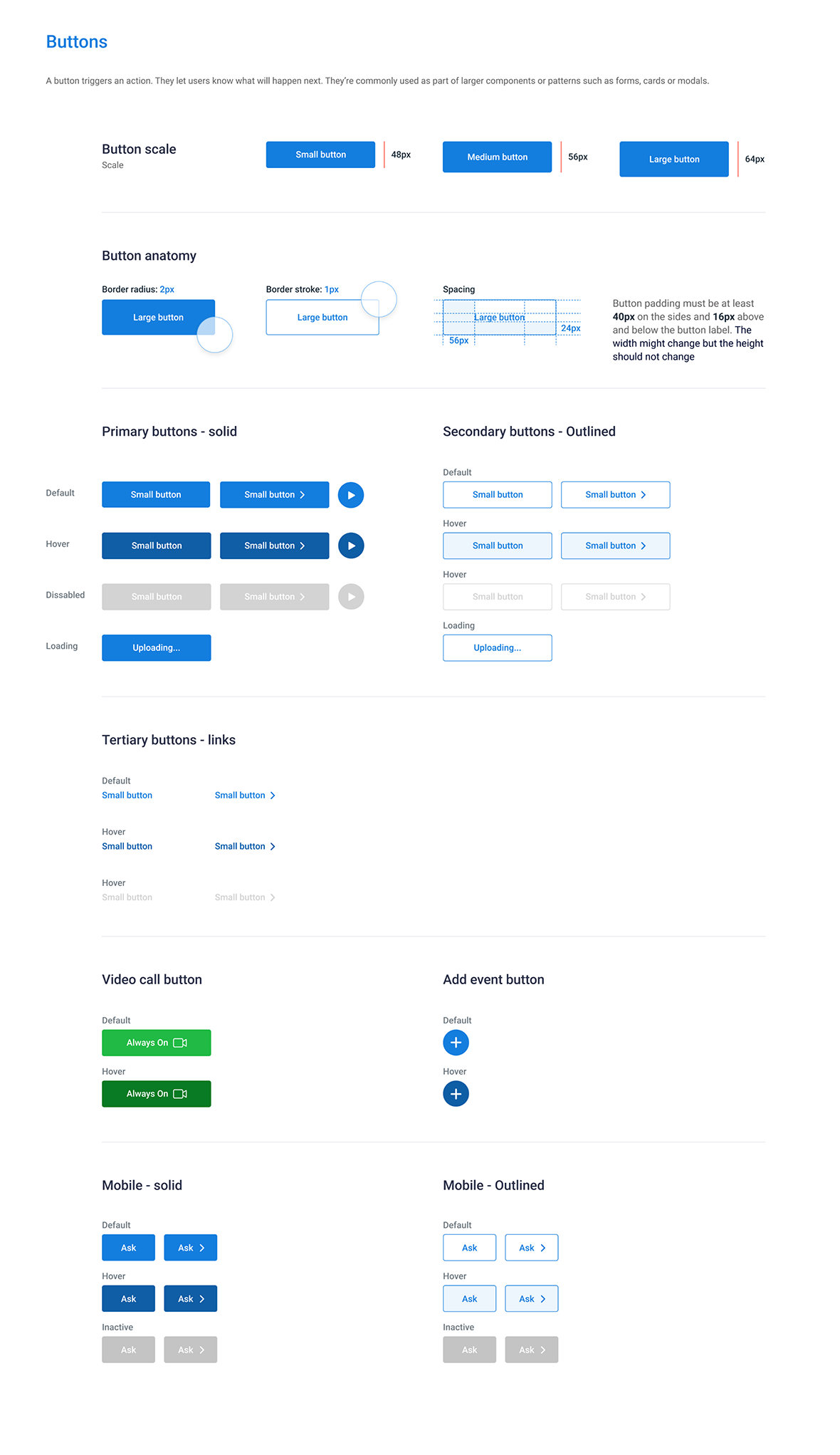
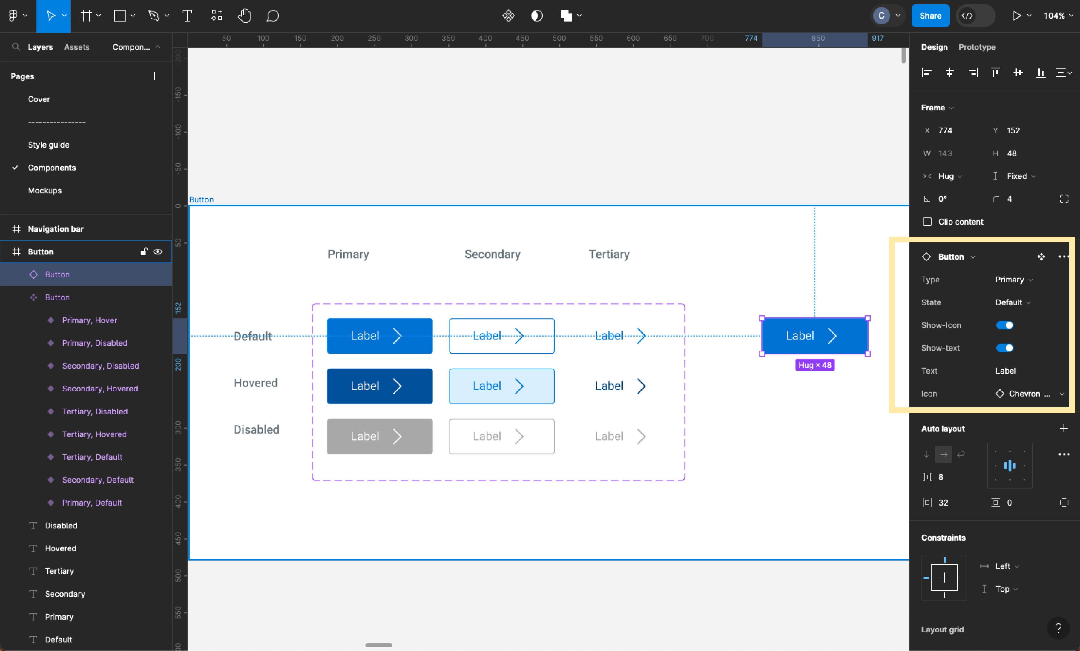
We also documented the exact anatomy of each component, starting with the buttons.
Building Figma Components
After designing the style guide, we created a Figma file and began crafting master components for every UI element used in our platform. This task, however, proved to be more complex than it may sound. We had to apply properties such as constraints and auto layout to maintain full control over each component's behavior and ensure responsiveness.
Additionally, we had to create various types, statuses, and states for each component, enabling every designer to manipulate them easily while adhering to the design guidelines.
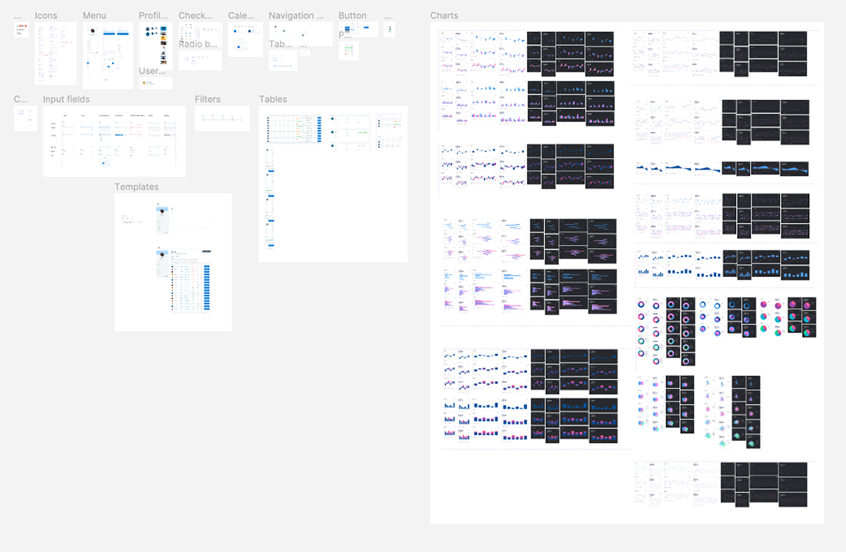
We ended up with a page full of ready-to-use master components.
At this stage, the entire team was getting really excited as we could already see the impact that the design system is going to have on our team's performance.
Building a design system allowed me to delve into the anatomy of each and every component, analyzing micro-interactions and complex responsive behaviour. For instance, I noticed that our tables weren't well-responsive on mobile devices: most information overflowed beyond the device's viewport, and in many cases, buttons and calls to action were hidden away. Users had to drag and scroll horizontally to view and reach the call to action, which was not intuitive enough.
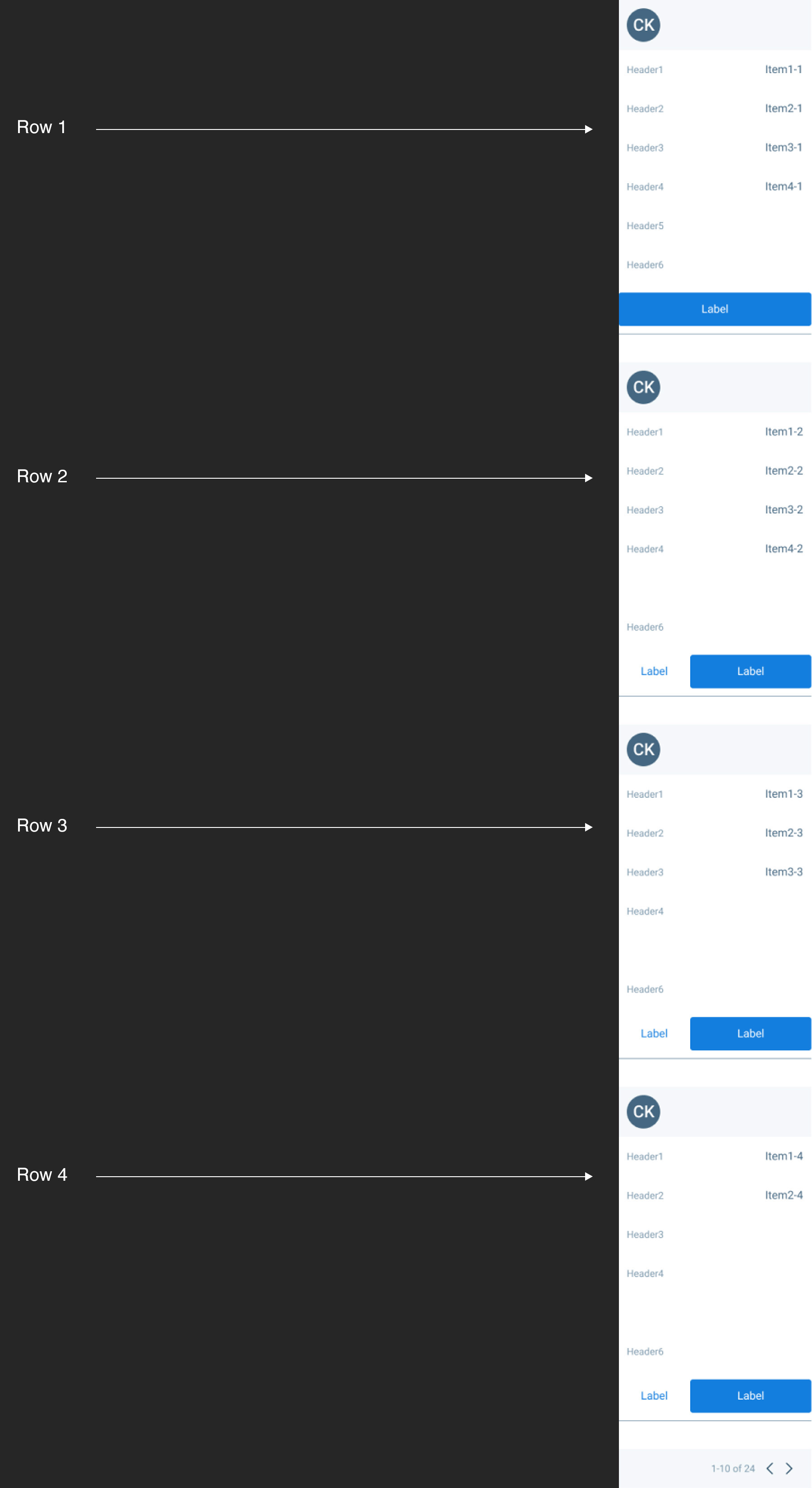
As a solution, I decided to design two different layouts displaying the exact same data: one for desktop screens and one for mobile screens.
Table responsiveness - Desktop version
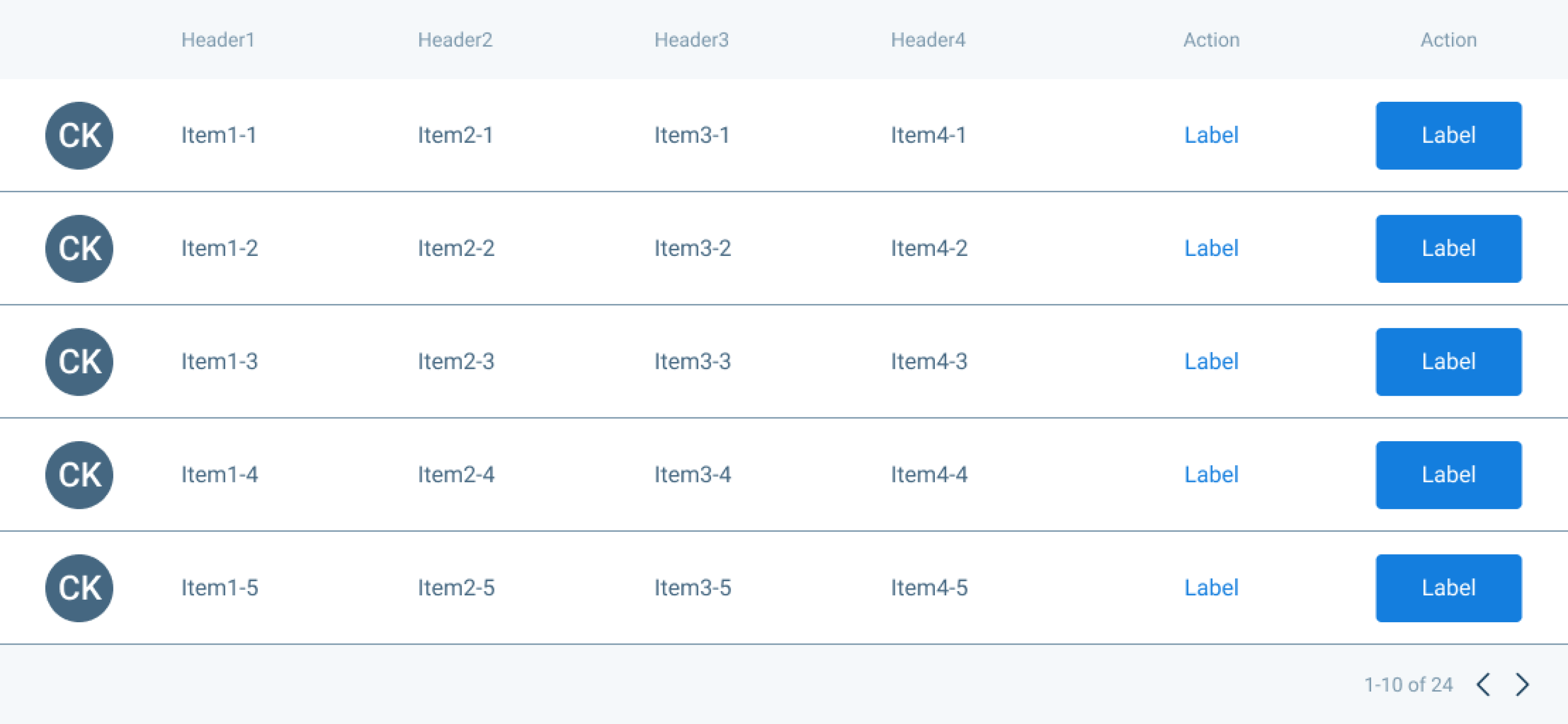
Table responsiveness - Mobile version
Thanks to the Design System I developed, BU's designers will be able to switch to the mobile version of a table they have designed simply by clicking on a toggle. Here is how the table's layout should look like on mobile screens.
Creating the Design Library
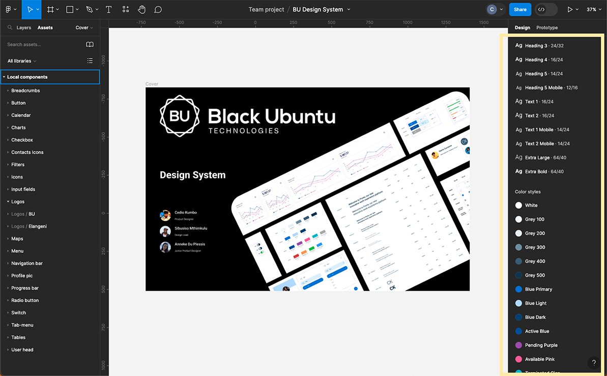
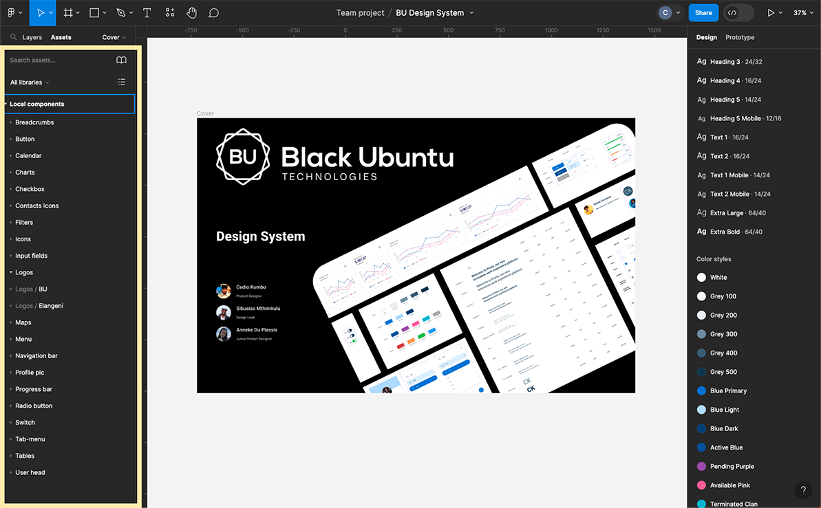
Finally, we created a style library containing all the agreed-upon styles, as well as an asset library where every designer has the possibility to grab and drop styles and components into their design files.
Conclusion
Design systems can have a significant return on investment by significantly increasing design speed and accuracy. When a designer wants to update a component style, they only need to request permission from a custodian. The custodian can then automatically update every single design component in all design files, eliminating the need to change those components one by one.
On a small design team, having a design system allows designers to shift their focus from building components from scratch to solving real human problems.
Developers can also benefit from a design system. In fact, they should be onboarded and involved in every step of designing and implementing it.

